Monday 8 September 2014

How to Increase row limit to Display/Export to Excel from Analysis

To Export more than 6500 OBIEE 11g records to Excel, perform the following steps:

1. Backup Instanceconfig.xml file from location:
\instances\instanceun\config\OracleBIPresentationServicesComponent\
coreapplication_obips1\instanceconfig.xml
2. After taking a backup of Existing instanceconfig.xml file and add/update the below xml code in your instanceconfig.xml file.
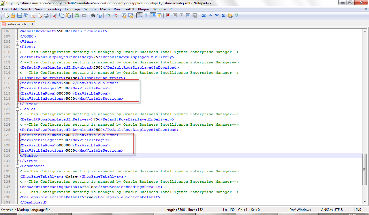
- specifies the maximum number of cells to be displayed in a view; it must be specified separately for each view type and is applicable to Table and Pivot views. The default is 50,000. The MaxCells should be equal to MaxVisibleColumns (in a pivot view) multiplied by the MaxVisibleRows.

- specifies the maximum number of pages included in a view when it is exposed via a Dashboard; the default is 1000.

- Applicable to the narrative view, or ticker, this element specifies the maximum number of records that can be processed to create a view; the default is 40,000.

> - specifies the maximum number of view prompts (or pages in a PDF) to be displayed for a Chart, Table or Pivot; the default is 1000 Pages.

- specifies the maximum number of rows to be displayed in a chart, pivot or table; the default is 500.

- specifies the maximum number of sections to be displayed in a chart, pivot or table; the default is 25 sections.

- specifies the maximum number of columns displayed in a chart of pivot table; the default is 300.

- specifies the default number of rows to display in a view. It can be applied to a Narrative, Pivot, Table or Trellis; the default is 25. This number should not exceen MaxVisibleRows.

- specifies the maximum number of rows to display in a view when it is exposed via a Dashboard. Applicable to a Pivot or Table, the default is 100.

- specifies the maximum number of rows included in a view when it is exported, such as a PDF or Excel export. It is applicable to a Pivot or Table and the default is 65,000.

- specifies the maximum amount of data sent to the browser for a chart. It is not relevant to any other view object.

Cube settings affect the display and processing of data in pivot tables and charts. Cube settings are listed within their own element tags, cube. In this way they are different to other tags that are largely reused between different elements.

 - specifies the maximum number of records returned for a view to then process. The default is 40,000 records.

 - specifies the maximum number of data cells that can be populated in a view; the default is 120,000 cells.

3. Save the file and re-start all of the BI Services through Enterprise Manager

OBI Mobile App Designer Installation

OBI Mobile App Designer Installation

The Oracle BI Mobile App Designer complements BI Mobile HD and is packaged with BI Foundation Suite and the BI Mobile option to OBIEE at no additional cost.
Follow the below steps to install Oracle BI Mobile App Designer:

1.     Prerequisites For Mobile Apps:

Download the required Patch for Mobile Apps:
  • Patch 16556157: OBIEE 11.1.1.7.1 [If your version of Oracle BI EE is not 11.1.1.7.1, download OBIEE BUNDLE PATCH 11.1.1.7.1 from My Oracle Support].
  • Patch 17004920 To support Oracle BI Mobile App Designer with Oracle BI Web Catalog, Apply OBIEE 11.1.1.7.1 MLR
  • Patch 17220944 - Download Oracle BI Mobile App Designer patch 17220944 from My Oracle Support, enabled through extending the OBIEE Weblogic domain

2.      Installation Steps:

1.      Stop All OBIEE 11G services (Weblogic Admin Server, Managed Server and OPMN services)
2.      Apply OBIEE 11.1.1.7.1 MLR Patch 17004920 using OPatch utility.
3.      Apply OBI Mobile App designer Patch 17220944 using OPatch utility.
4.      Deploy the OBI Mobile App Designer (MAD) manually using WebLogic configuration assistant as shown in below:
Open Command prompt window and Navigate to MW_HOME>\Oracle_BI1\common\bin\
Run ‘config.bat’ to start the Weblogic configuration assistant tool.
On welcome screen, select ‘Extend an existing Weblogic domain‘ and click Next.
Choose the domain to extend, for example: bifoundation_domain
Choose Extend my domain using an existing extension template and Set the Template Location to: <MW_HOME>/Oracle_BI1/common/templates/applications/oracle.bimad_template_11.1.1.jar
On Configuration summary, review the deployment details and click “Extend” button.
Upon successful configuration, you see the following screen. Click “Done” to close this window.
Great. This concludes the OBI MAD application deployment in our OBIEE 11G application. Now we need to update the Security Configurations for OBI MAD. This is mandatory step to use OBI MAD in OBIEE 11G presentation services.

3.     Update Security Configuration for Oracle BI Mobile App Designer:

This is a Python script to update the OBIEE 11G domain (bifoundation_domain) system JAZN file (system-jazn-data.xml) with the security grants required for BI Mobile App Designer. This step is required only the first time you apply the patch.
Navigate to <MW_HOME>\Oracle_BI1\bifoundation\install and run the command: <MW_HOME>\Oracle_BI1\common\bin\wlst.cmd addMADCodeGrants.py t3://<hostname>:7001 <weblogic_Admin_Username>
After successful execution, Start All OBIEE 11G services (Weblogic Admin, Managed servers and OPMN)
Once the services are started, Login OBIEE 11G analytics (http://hostname:9704/analytics)
Right after, you logged into OBIEE 11G, click the ‘New’ Menu. In this you will see a new application category called “Mobile Application” and you see the “Mobile App” module. Click on that to start design and developing the reports.

4.     Creating Basic Mobile App

In the left navigation pane, under Create, click Mobile App to start the Mobile App Designer.
The Create App dialog box is displayed. Under "Choose Target Device Type," select Tablet.
On the next page, select the data source:
  1. Under "Choose a data source for your App," select BI Subject Area.
  2. In the Subject Area drop-down list, select Sample Sales Lite.
Click Save to open the Save As dialog box.
Save the app as OBE_Demo in My Folders, and then click OK.
Open the OBE_Demo Mobile App report. Notice that the data source elements are listed in the navigation pane on the left side of the designer. You can drag and drop columns from the data source to the workspace to build the elements of your application.
Notice that the pages of the presentation are displayed in a sidebar, similar to presentation programs such as Power Point or Keynote. By default, a new app contains only a cover page.
You can add pages to your app using either the provided layout options, or you can insert a blank page and design a custom layout. In the following steps, you add a page with a bar chart that shows revenue by quarter, a pie chart that shows revenue by organization, and a table that shows revenue detail by quarter, product type, and product.
On the Insert tab, select New Page > 3 Cells.
Creating Chat View in Mobile Apps
A second page is added to the app. Select the first cell.
In the ribbon, click the Insert tab, and then click Chart.
Note: You can also drag and drop the chart icon from the ribbon to a cell in the layout pane.
Specify the subject area columns to define the chart:
  1. From the Sample Sales Lite hierarchy, drag Per Name Qtr (located under Time) to the Label area of the chart.
  1. From the Sample Sales Lite hierarchy, drag Revenue (located under Base Facts) to the Value area of the chart.
Resize the chart and hide the chart legend
  1. Drag the resize handle on the lower right corner of the chart to resize the chart to fit the cell.
  1. On the ribbon, click the Chart tab, and then select Legend > No Legend.
The legend is removed from the chart.
Next, insert another chart. On the Insert tab, drag and drop the Chart icon to the second cell in the layout grid.
Specify the subject area columns to define the chart:
  1. From the Sample Sales Lite hierarchy, drag Revenue (located under Base Facts) to the Value area of the chart.
  1. From the Sample Sales Lite hierarchy, drag Organization (located under Offices) to the Label area of the chart.
  1. In the chart, drag Organization from the Label area to the Series area to view the Organization data as a series instead of individual bars.
On the Chart tab, select Chart Types > Pie > Pie to change the chart display type.
The following chart types are available:
  • Area
  • Bar (default)
  • Bubble
  • Line
  • Pie
  • Circular
  • 3D Graphs
  • Funnel
Drag the resize handle to resize the pie chart to fit the cell.
Next, insert a table. On the Insert tab, drag and drop the Table icon to the third cell in the layout grid.
Creating Table View in Mobile Apps
Drag the following columns from the data source to the table:
  • Per Name Qtr (located under Sample Sales Lite > Time)
  • Product Type (located under Sample Sales Lite > Products)
  • Product (located under Sample Sales Lite > Products)
  • Revenue (located under Sample Sales Lite > Base Facts)
Customize the table formatting
  1. Double-click the column header Per Name Qtr to edit the header. Replace Per Name Qtr with Quarter.
  1. Drag the column edges to resize the table columns.
  1. Select the data in the Revenue column to display the Column tab in the ribbon.
  1. On the Column tab, in the Data Formatting drop-down list, select -1,237.57 (Number).
Renaming the Page:
In the Pages list, double-click Page 2 to edit the page name. Replace Page 2 with Analysis.
Notice that when you press Enter, the page header in the layout pane also changes to Analysis.
Click the Save icon to save your app.

Click Preview to open a web preview of your app. Note, you can preview in a new Window too.
If you have a QR Code scanner app on your tablet device, preview the app on your tablet instead of on the web.
  1. Click On Mobile.
  1. The QR code for the app preview is displayed. Use a QR code scanner on your tablet device to scan the code. This opens the app preview on your tablet device. Note: If you do not have a QR code scanner app on your tablet, you can copy the app URL (displayed under the QR code) and e-mail it to your mobile device.
Clicking on an item in the web-based preview is equivalent to tapping the same item when the app is open in a tablet. Because you can also preview your app in a tablet, the instructions for previewing your apps in this tutorial use the verb "tap" instead of "click."


The Analysis page is displayed. Notice that the preview displays your two charts and the table you created.